
The journal costs $135. A Moleskine or a Leuchtturm costs a fraction of that, and one or the other is sitting on most desks in the country. So the fair question, the one I’d ask too, is what the difference actually buys you.
Start with the weights, because they explain most of what follows. The be still journal is 120gsm. The Leuchtturm Classic is 80. The Moleskine is around 70. You feel that gap the moment you write, and it runs through everything the test showed.
I could argue that in the abstract. Instead I tested it. This is the measurement of a decision I made by feel, the paper I chose by hand rather than off a spec sheet, put next to the two notebooks most people already own.
What I actually did
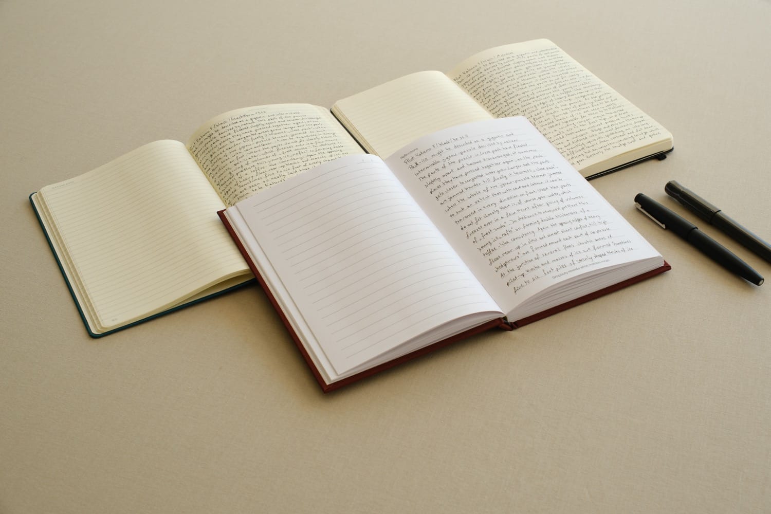
On 21 September I sat down with three notebooks and three pens and wrote the same page in every combination. The be still A5 in Knight Smooth White 120gsm, the Leuchtturm1917 Classic A5 in 80gsm, and the Moleskine Classic Large at roughly 70gsm. I used the standard Leuchtturm, the one most people actually own, rather than its heavier special edition. This is the comparison that matters, the notebooks that are really on people’s desks.
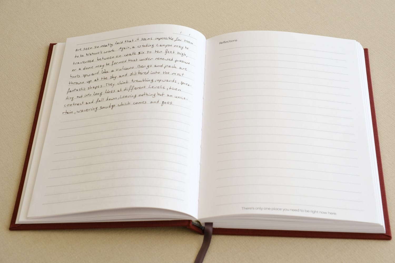
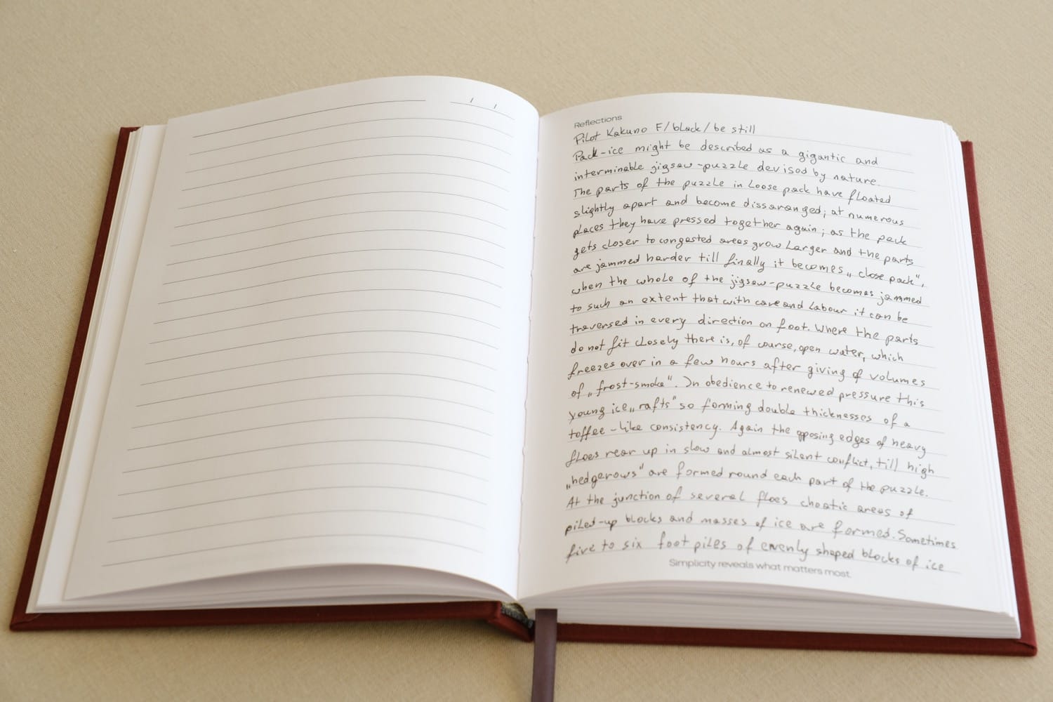
Each sheet was filled on the front, with the top half of the reverse written too, so any show-through reads against clean paper below it. The same passage every time, a stretch of Shackleton’s account of the Endurance, copied by hand because I wanted honest handwriting on a page and a passage that carried no message of its own. Same daylight, a tripod, one fixed exposure, the books swapped in and out and shot back to back so nothing in the light could flatter one over another.
It came to about seven hours of copying. My wrist knew about it the next day. I mention the seven hours because a test like this is only worth anything if it was done properly, and properly is slow.
Does the paper show through?
Yes, all paper does to some degree. What matters is how much. Least to most, it went be still, then the Leuchtturm, then the Moleskine, the same order as the weights. The heavier sheet holds more back, which is exactly what the extra weight is there to do.
What I did not get on the be still paper was bleed-through. With all three pens the ink stayed on the surface. A faint ghost on the far side, yes. Ink actually coming through the sheet, no. That holds the difference in a notebook paper weight comparison worth understanding: show-through is the shadow of the writing, bleed-through is the ink itself arriving on the other side, and only one of them is a real problem.
The pens mattered more than I expected
The pens told their own story, and it surprised me. The wettest pen was the worst on every paper. The Lamy rollerball laid down the most ink and showed through most, consistently, in all three notebooks, which makes that a property of the pen and not of any one page. If you want less show-through in whatever you already own, change the pen before you blame the paper.
Fountain pens are the ones people worry about most on a page like this, so I tested one properly. A Pilot Kakuno with a fine nib and a standard black cartridge wrote cleanly, no feathering, no bleed-through, and showed through no more than the ballpoint did. I will only claim what I tested: that pen, that ink. Broad wet nibs and heavily saturated inks are a different question and I have not run it. But on the pen most people reach for, the paper held up, and I write with the Kakuno now.
Why holding it up to the light proves nothing
Someone always holds a page up to a window. So I will save you the trouble: backlit, all three show through. Every one of them. No writing paper disappears with a light behind it. Papers built for opacity with added fillers do better, but none of them vanish. It makes a dramatic photo and it tells you nothing, because nobody reads a page with a lamp behind it. That is why you will not find a backlit shot doing the work on this page, and why you should be wary of anyone who leans on one.
Less yellow, not whiter
The other visible difference is colour. Measured off a single frame under one exposure, the be still paper is roughly four times less yellow than either of the others. What your eye reads is a warmer page, the warm natural white I set out to get, without the cold bright white of an office sheet or the cream of a keepsake. It reads as less yellow rather than brighter, which is the point: easy to sit in front of for a long stretch, and never clinical.
Fewer words on the page
Two things the photographs show that are not about the paper itself. The be still journal has more generous line spacing than either, and a margin down both sides where neither of them has one. You fit fewer words on the page, by design. The object is built for room, not density, for writing you want to sit with rather than cram onto a sheet. That space is part of what the journal is for.
What the $135 actually buys
So, back to the price. What the money buys is paper that holds ink without bleeding, a warmer page that is easier on the eye through a long sitting, generous spacing and margins that give the writing room, sewn so it lies flat, and made in Melbourne in small runs. Whether that is worth it to you depends on what you want from the thing you write in every day.
A Moleskine is a third of the price and a good notebook, which is why everyone owns one. The Leuchtturm is good too. In a straight comparison of moleskine vs leuchtturm paper, both earn their place. be still is the heavier, warmer, more generous option, a minimalist journal for people who would rather have those things than the lowest price.
The difference used to be something I asserted in a product description. Now it is on the desk, measured, and you can see it for yourself.
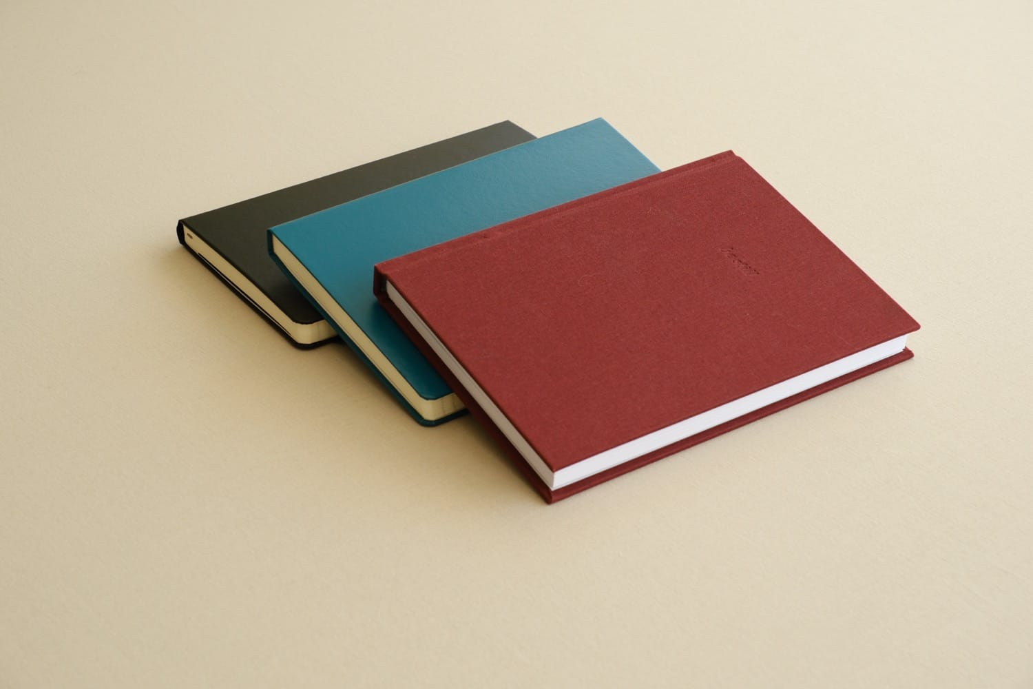
The journal in the test is the one we make. View the journal.
The writing, occasionally. Subscribe.